
This whole project started from a question that has nothing to do with app stores. When I wrote the thesis it revisits, my university’s policy on generative AI was simple: don’t. Large language models were brand new as a public product (ChatGPT had been out for about two months), and a rule against using them in a thesis felt uncontroversial enough that nobody really argued about it.
Three years is not a long time, and the same rule now reads as almost impossible to enforce, and stranger to justify. It has become hard to find a student who isn’t using some form of AI assistance to write a thesis, and harder still to make the case that they shouldn’t. That reversal (not the app store literature) is what sent me back to reopen my own thesis this year: not to rewrite it, but to see what a second, more skeptical pass could find in work I had trusted untouched for three years.
Every figure and every number below is produced by a script in the review repository.
In February 2023 I submitted a thesis on a narrow question: when someone lands on an app’s product page in a store, which element of that page makes them decide to install it? I tested three of them, the average review rating, the number of downloads, and the developer’s brand, carried by the app name, the icon and the developer’s own name. I manipulated screenshots of a real Play Store page: each element exists in two versions, a strong one and a weak one, and every respondent saw three pages (one per element, in a random order, showing one of the two versions drawn at random). Nobody saw both versions of the same element. Then I measured what the literature calls intention to download.
The answer I published was that the developer’s brand is the most decisive element. Reputation comes second. Popularity does essentially nothing, at least in a category with low network effects.
This year I reopened the files. The data survived the scrutiny: the randomization worked, there are no missing values, and every regression in the thesis reproduces to four decimal places. The analysis did not. I made three mistakes, and none of them was in the data, they were in what I did with it.
Mistake One: When Three Regressions Can’t Be a Comparison
The headline finding came from placing three coefficients side by side: 1.53 for brand, 0.50 for reputation, 0.36 for popularity. Brand is visibly the largest. Case closed.
Except that those three numbers came from three different regressions, estimated on three different groups of respondents. Nowhere in the thesis is there a test of whether 1.53 differs from 0.50. I looked at them and concluded.
So I ran the test I should have run. One model, all 1,473 answers at once, with an adjustment for the fact that each person now contributes three of them:
| Element | Effect on intention to download (1–7 scale) | 95% CI |
|---|---|---|
| Developer’s brand | +1.05 | 0.81 to 1.29 |
| Reputation (rating) | +0.85 | 0.61 to 1.09 |
| Popularity (downloads) | +0.22 | −0.02 to 0.46 |
Averaged over the three judgements each respondent made, brand and reputation are not distinguishable (p = 0.24). Both clearly beat popularity. My three-step hierarchy is really two steps, on that average, and the qualification turns out to matter.
The interesting part is what the fragmentation cost. Splitting one sample into nine subsamples threw away most of the statistical power I had collected, and reputation’s effect rose by two thirds, from 0.50 to 0.85. About half of that rise is precision: on the same first-app question, one model on all the data puts reputation at 0.68 rather than 0.50. The other half comes from the change of question, because reputation is stronger in the judgements that come later.
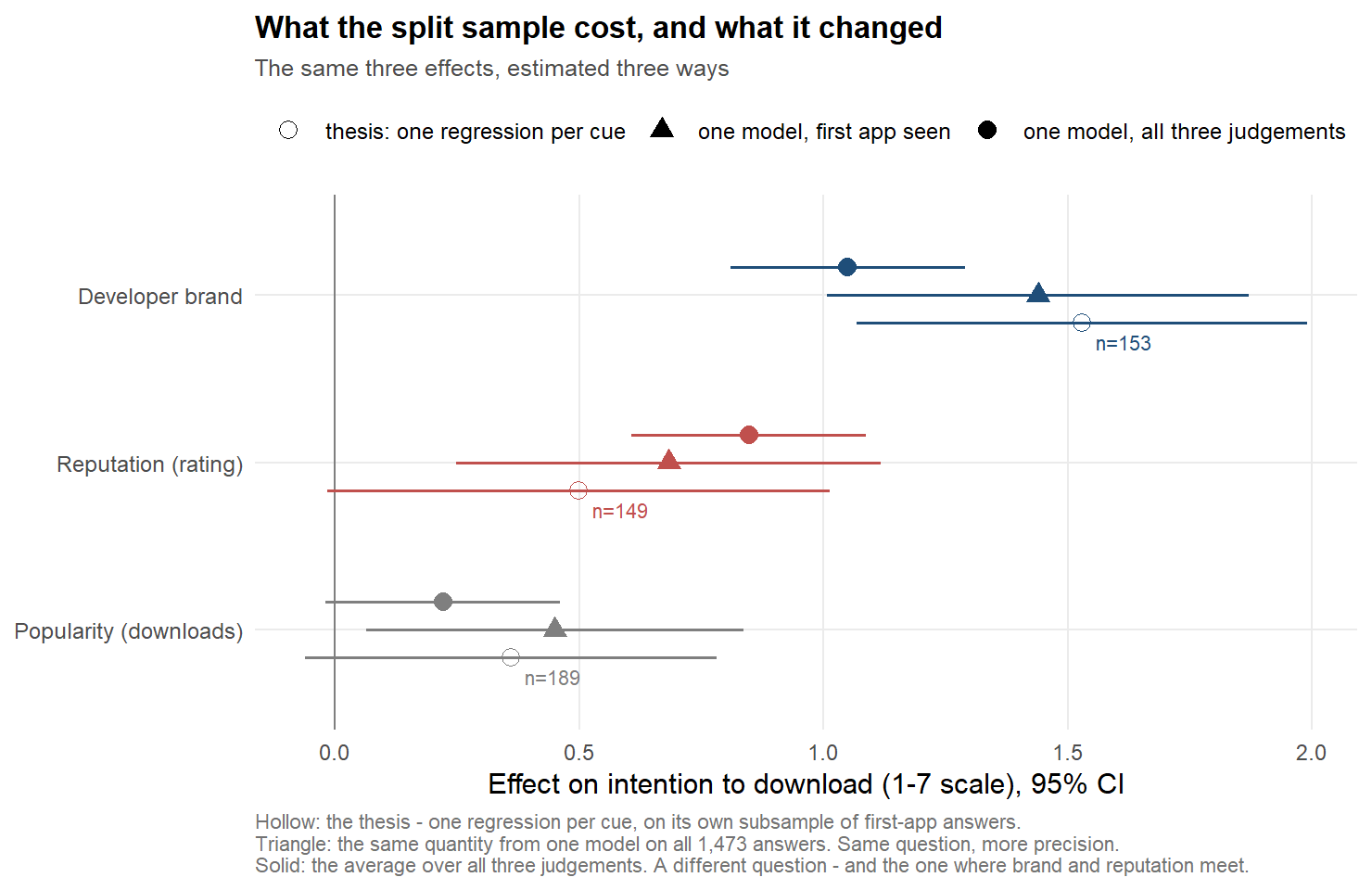
The same three effects, estimated three ways. Hollow: the thesis, one regression per element on its own subsample. Triangle: the same question (the first app seen) from one model on all the data. Solid: the average over all three judgements, which is a different question.
To be sure this was not simply my new favourite model talking, I re-ran the comparison every defensible way: 24 combinations of sample, model type and controls, one of which failed to converge and was dropped. Brand comes out ahead in 4 of the remaining 23, and those four are not a random corner of the picture. They are exactly the four that use only the first app each respondent saw.
Which is the interesting part, because measuring the first app was a deliberate choice in 2022 and not an accident: the first screen is the only one a respondent judges before having anything to compare it against. On that quantity, the one the design was built to produce, brand does lead reputation: +0.76 points, p = 0.03, and +1.02 (p = 0.007) in the sample the thesis actually used.
So the headline was not an artefact. The thesis made two claims: brand wins on the first app, and loses its lead once the user has seen other apps. It tested neither. Tested now, the first claim holds (+0.76, p = 0.03); the second does not reach significance (p = 0.10), so the data show a tendency, not a proven change.
The mistake, then, is narrower than “the ranking collapses” and harder to shrug off. Nine regressions on nine subsamples share no parameters, so no comparison between the three elements could be tested at all, and none was. One model on all 1,473 answers gives the same first-app estimate, plus the test the thesis was missing, plus what happens after the user has seen alternatives.
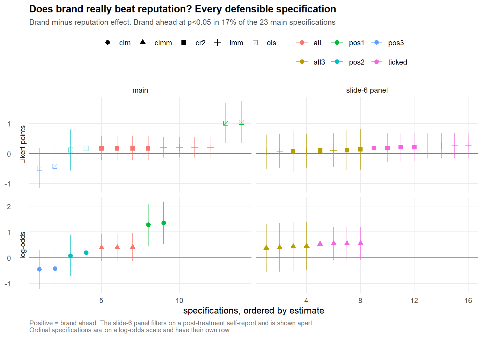
Every defensible specification of the same comparison. Brand wins clearly only where the design aimed it, on the first app each respondent saw; everywhere else brand and reputation are indistinguishable.
Mistake Two: My “Manipulation Check” Was Not One
The result people quoted back to me was the counter-intuitive one: download counts do not matter. In a market where everybody watches install numbers, that is an enjoyable thing to say. It is also not quite what the thesis claimed. The experiment used scanner apps precisely because their network effects are low: a scanner is no more useful to you because millions of other people use it, so a download count can work only as a signal of what others think, not as a promise of extra value. The claim was that popularity is ineffective in that setting.
I no longer believe the data supports even that, for two reasons: one I should have caught in 2022, and one I did catch and did not follow through.
The first is embarrassing. I went back to the stimulus images themselves. The low-popularity version of the app displays 10,000+ downloads alongside 84,000 reviews. More reviews than downloads. It is impossible, and the review count was held constant across the two conditions, so the defect sits entirely in the weak version, precisely the one that had to carry the comparison.
The second is subtler, and it is a problem of labelling rather than of analysis. The thesis reports, model by model, a manipulation check: the share of respondents who confirmed they had noticed each element. What I actually asked, once, at the very end, was which factors did you take into consideration?, with nine boxes to tick. That is not a check that the manipulation registered. It is people reporting, after the fact, what they believe they did.
I knew this at the time (the thesis calls the question “a compromise (and not ideal) version”), and the decision that followed was deliberate: measure it, report it, and condition nothing on it. That decision was right, and I would make it again. What I failed to do was state the consequence. A study whose only perception measure is a post-treatment self-report has no verification that the manipulation was seen at all, and the word check, repeated in nine tables, quietly suggests that it does.
The consequence lands on popularity, because that is where a perception check would have mattered most. Among the 60% who ticked “number of downloads”, the popularity effect more than doubles, to +0.49, and becomes significant. I report that as an illustration and not as a correction: the comparison is close to circular, since people moved by download counts are more likely to say they looked at them. Between a broken stimulus and an unverifiable measure of attention, the null had less support than I gave it credit for.
So what is the honest answer? Before looking, I fixed the smallest effect that would matter in practice. Every reasonable way of deriving it lands between 0.26 and 0.33 scale points. Measured against that bar:
- on the first app a respondent sees, with nothing else on screen, popularity does work: +0.45, and that one is real;
- on the second app it is −0.22 and on the third +0.40, and both are inconclusive: the interval is wider than the bar in either direction, so I cannot separate “nothing” from “too small to matter”, or from something quite large.
I first wrote that second bullet as a single number, +0.07 after comparison, which is what you get by averaging the second and third app together. It is also the shape of a mistake I had just finished criticising in my own thesis: an average of −0.22 and +0.40 describes a situation nobody was ever in. And it flattered a tidy story I liked, because the third app is not measurably different from the first (0.05 apart, p = 0.86). The dip sits on the second app alone, and no difference between positions survives a correction for having looked at all three.
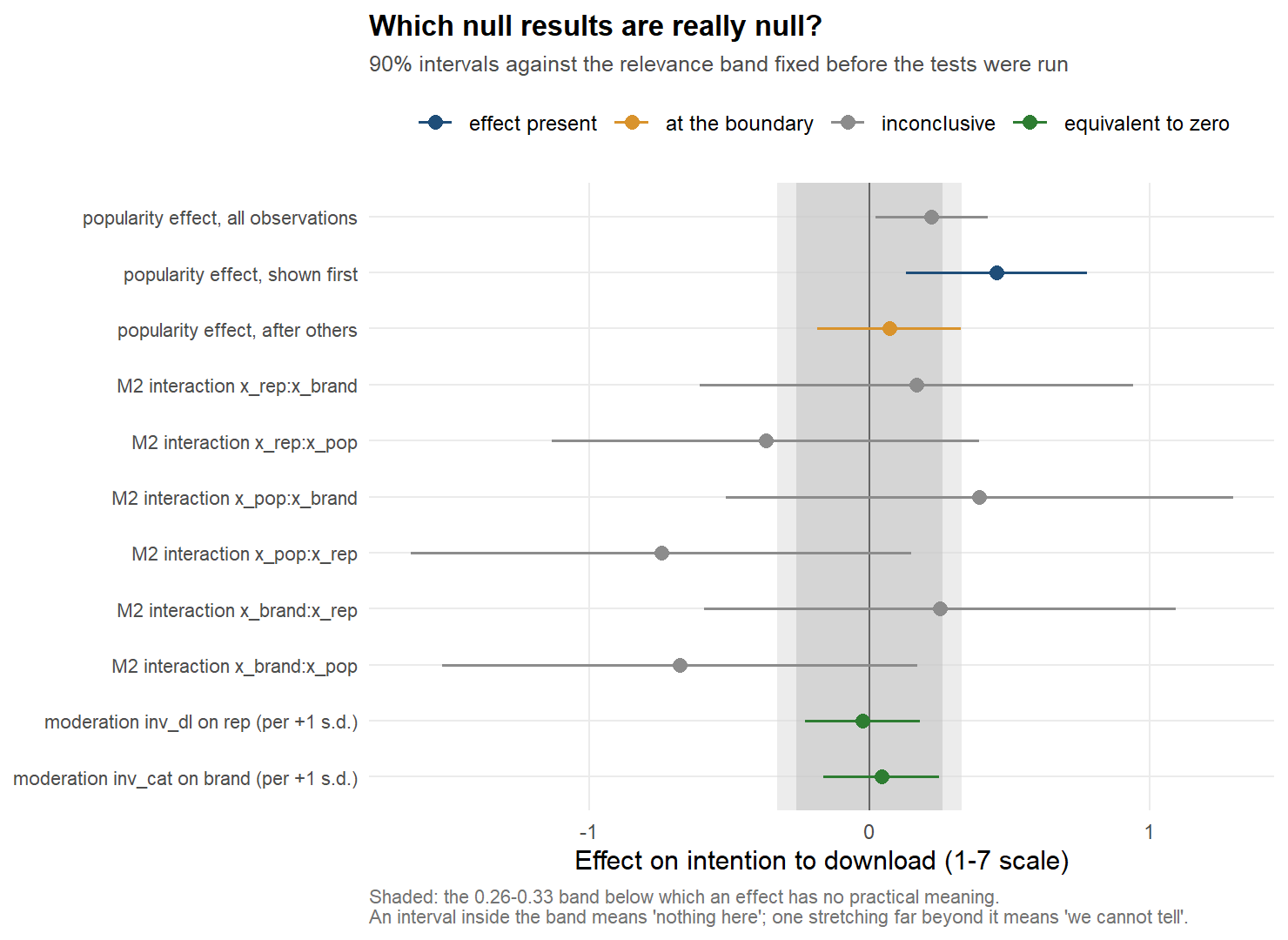
Which null results are really null. The shaded band is the zone of practical irrelevance, fixed before the tests were run. An interval far wider than the band means the study could not see, not that there was nothing to see.
“Download counts do not matter” was too strong. What I can defend is smaller and less quotable: where network effects are low, download counts move intention on the first app someone sees, and after that this study cannot tell you. Which is still enough to retire the claim I published.
Mistake Three: Silence Isn’t Evidence
The thesis concludes that there is no interaction between the three elements. Only one element was manipulated per screen, so here “interaction” can only mean something narrower: whether the effect of this app’s rating depends on the brand of an app seen earlier. The thesis admits the limit in its methods; the abstract does not.
The real problem is that the answer is empty either way. My design could only have detected an interaction of 1.3 to 1.5 points on the 7-point scale, as large as the main effects themselves (0.2 to 1.0), and interactions are usually far smaller than that. Finding none was not evidence of absence, only of an instrument too coarse to see them.
The two moderation results I built managerial advice on are the opposite case. Here the data can say more than “not significant”: both effects fall inside the margin I had fixed in advance as too small to matter. They are not unproven; they are practically absent.
What Holds Up and One Thing That Is New
The brand effect is the one result that survives everything. Of the 81 coefficients I estimated across nine regressions, exactly two survive a correction for having run that many tests, and both are the brand effect.
Brand and reputation are equally powerful only in the average. Split by position in the sequence, the picture is sharper than anything I originally claimed:
| 1st app seen | 2nd | 3rd | |
|---|---|---|---|
| Developer’s brand | +1.44 | +0.88 | +0.92 |
| Reputation | +0.68 | +0.63 | +1.13 |
| Popularity | +0.45 | −0.22 | +0.40 |
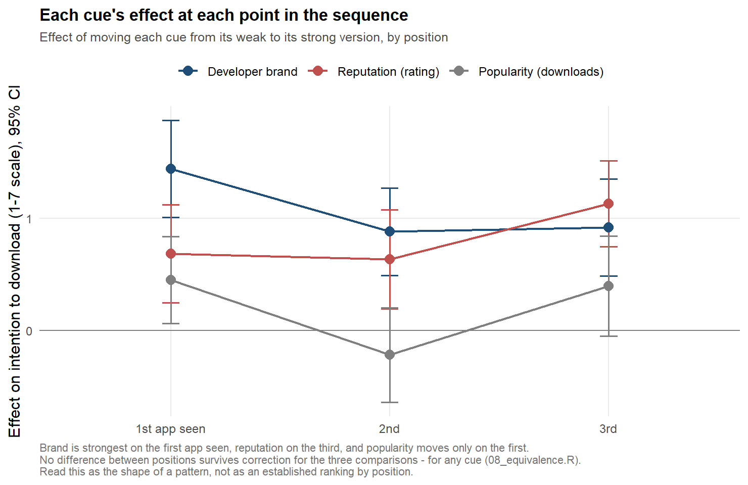
Each element’s effect at each position in the sequence, with 95% intervals. Brand is strongest on the first app seen, reputation on the third, but no difference between positions survives a correction for multiple looks: this is the shape of a pattern, not a demonstrated one.
Brand dominates when there is nothing to compare against: that gap is the one my thesis found, and it holds. Once a user has seen alternatives, the two converge: averaging the second and third app together, 0.89 against 0.92. Stated as a probability, the brand leads reputation with 99% probability before comparison and 48% after, a coin toss. What the data does not establish is that those two situations differ from each other (p = 0.10), and no pairwise difference between the three positions survives correction for any of the three elements. So read the movement as the shape of something worth testing properly, not as a result.
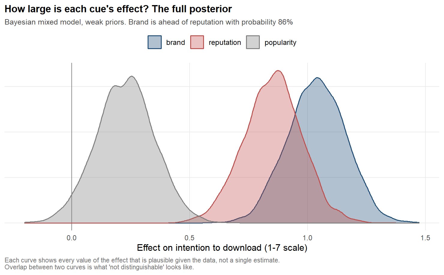
How large each effect plausibly is, given the data. Where two curves overlap, the data cannot tell the two elements apart, which is what “not distinguishable” looks like.
There is a practical reading, and it stands or falls with that pattern. A strong brand is worth most in the moment when the user is not shopping around: a link from a search result, an advertisement, a recommendation. Ratings earn their keep in the browse-and-compare context, where the user is actively collecting information. For a new entrant this is better news than it sounds. You cannot buy Adobe’s brand, but you can be the app that survives the comparison.
And one genuinely new finding, which I had predicted in writing would fail before I ran it: respondents differ a great deal in how much any of this moves them, and the difference is systematic. The people most inclined to download things in general are the least moved by what the listing shows (correlation −0.59). The cues do their work on the undecided. An average effect across everybody conceals that entirely.
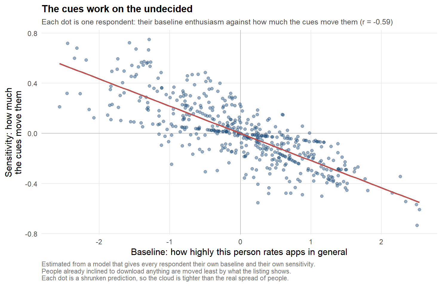
Each dot is one respondent (their baseline enthusiasm against how much the page elements move them). The cues work on the undecided. The points are model predictions, pulled towards the average where a respondent gives little information.
Four Things I Checked That Changed Nothing
A reanalysis is only worth as much as the checks that could have embarrassed it. Four of them did not.
Respondents do not treat a 1–7 scale as a ruler. An answer of 6 covers nearly twice as much underlying intention as an answer of 3: people who are quite sure still stop one short of the top, which is what avoiding the ends of a scale looks like. Re-estimating everything without assuming even spacing moves the effects by 0.7 to 3.0 percentage points and leaves the ranking untouched.
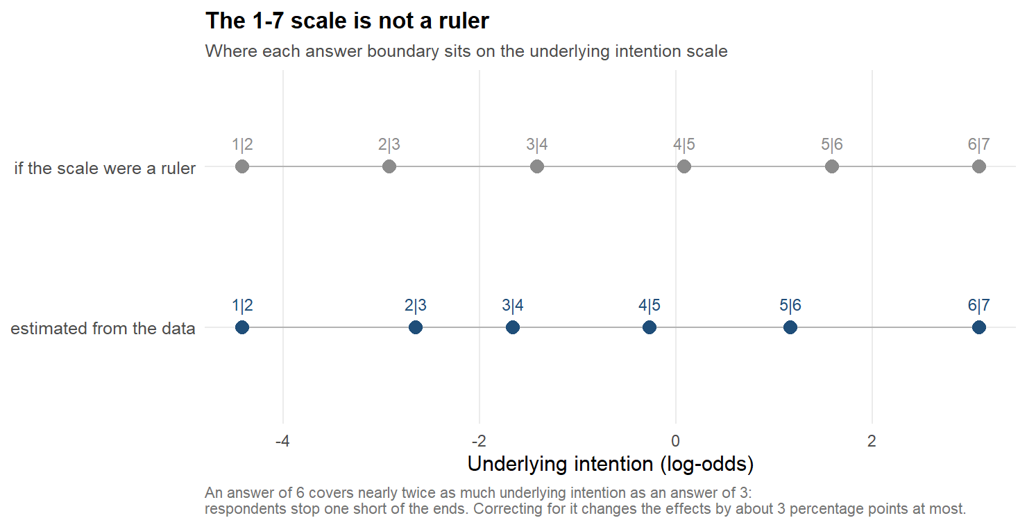
Where each answer boundary sits on the underlying intention scale, against what an evenly spaced scale would look like.
The effects do not depend measurably on who is answering (not on age, gender, education or occupation). Students respond to reputation roughly twice as strongly as employed respondents, which is a tidy story that does not pass its own test; with 69% students in the sample, it could not have passed.
And removing the 33 respondents who rushed or gave a single answer to an entire scale moves every effect slightly upwards, as removing noise should, and changes nothing else.
The figures in the thesis are not drawn on the raw 1–7 answers but on a mean-centred version of them, one constant subtracted per element. Subtracting a constant per group is harmless as long as the model already knows which group it is looking at, and mine did: re-estimating everything on the raw answers moves no coefficient by more than 0.00000000005. It does cost the reader something: the heights of the three lines in my figure are then not comparable, only their slopes are, and in four of six panels the centred version ranks the three elements differently from the raw one. What I read off that figure was a slope, so the conclusion survives. The centring that would have mattered in a repeated-measures design is by respondent rather than by element, and that one cannot be done by subtracting a mean at all: it needs the respondent inside the model, which is precisely what my ANOVA was missing. Done the wrong way, by subtraction, it would have shrunk every effect by about a third.
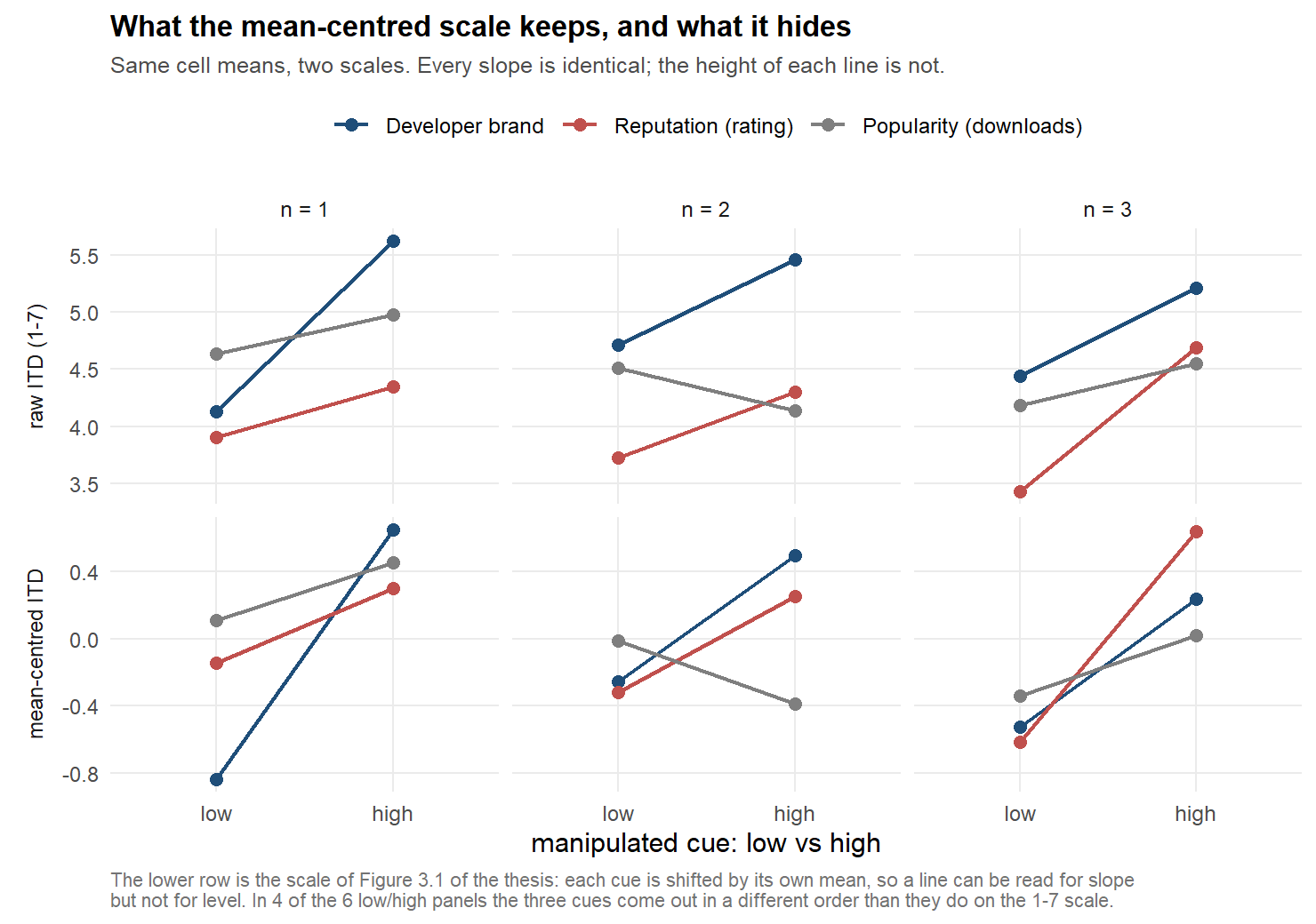
The same cell means on the raw answer scale and on the mean-centred scale used in the thesis figures. The slopes are identical; the order of the three lines is not.
What Three Years of Distance Taught Me
Three things, none of them about app stores.
Protecting an estimand and splitting a sample are different things, and I did the second while meaning the first. Measuring only the first app each respondent saw was the right instinct: it is the only judgement made before there is anything to compare against. Estimating it in nine disconnected regressions was not, because regressions that share no parameters cannot be compared with each other, which is exactly what I then did with them. I stated both halves of the result, and tested neither.
“Not significant” is not a finding until you say what you could have detected. Every null result I reported deserved a sentence about the smallest effect the design could see. Three of them dissolve under that question.
Look at your stimuli again. The worst problem in this project (a screenshot showing more reviews than downloads) was not in the models or in the data. It was in an image file I had looked at a hundred times in 2022 and never actually checked.
A note on how this was done. The reanalysis was carried out with AI assistance, and the idea began as a small curiosity: how would an AI have written my master’s thesis? The answer turned out to be less interesting than the question it provoked, which is how an AI would review it. It did not find anything I could not have found myself in 2023. It did the one thing I did not do, which is to check every claim against the evidence I already had, including the claims that were convenient. That is a low bar, and I did not clear it the first time.
In 2023, generative AI was allowed to check my English grammar and nothing else. This year the same class of tool helped me take the analysis apart and rebuild it in under two weeks. Yet none of the three mistakes needed a machine: a calculator and some patience would have caught them in 2022. What was missing was the decision to doubt something I already believed, and that decision is still mine.
What AI speeds up is execution: rerunning twenty-four specifications takes a few minutes. Judgment (whether a null is really null, whether a convenient finding survives doubt) moves at the speed it always did. The risk is mistaking one speed for the other. This piece was written with the same kind of help, so it deserves the same scrutiny: if a fourth mistake is hiding in it, I would like to know.
The full review, code, pre-set decision rules and logs are in the review repository; the original thesis, data and code are here.